

Recreation.gov App Redesign
In typical government app fashion, the recreation.gov app looks like a modern, updated camping app; but behind the scenes it is an app that sends it users in circles. After some user testing I found several flaws in the Recreation.gov campsite booking feature. In this case study I implemented user interviews to figure out what campers actually want when booking a campsite.
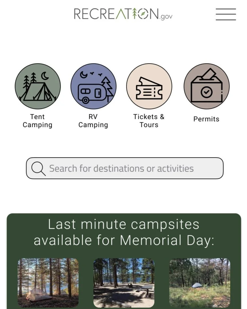
Homepage Redesign
Creating a new homepage for the Recreation.gov app was my first challenge. I chose to use buttons to help filter campsites by type right away, narrowing the search results when searching for destinations. I also created an area for last minute availabilities for campers with schedule limitations.
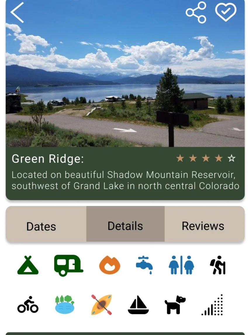
Campground Information Page
During user interviews I discovered that users want quick and easy ways to see if a campsite has the amenities campers want. To solve this problem I added icons to the main information page of each campground. Campers can see at a quick glance if their campsite has water, restrooms, electric hookups, and other amazing amenities. I also added a feature where campers can see how much cell signal a specific campsite has.
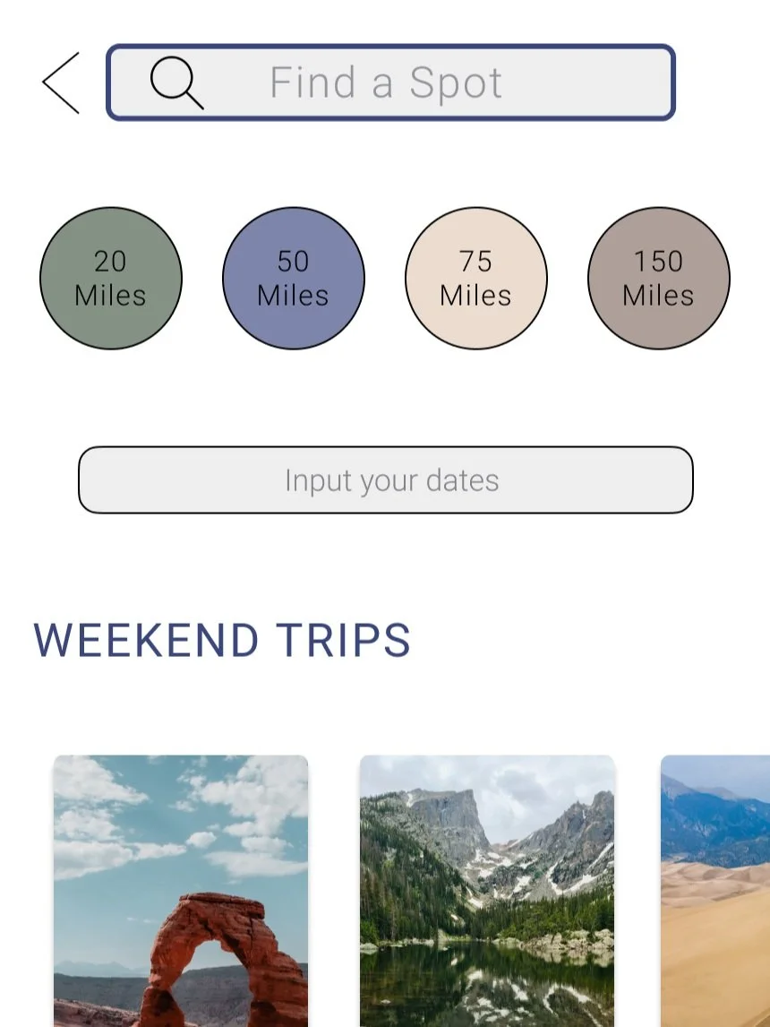
Search
For the search page I wanted several ways to search. Either by date or distance. Some campers expressed that distance is more important than dates while others really wanted to search specific dates. I also added a spot for weekend trips that are based on the campers location as well as availability for the upcoming weekend.