

Washington, we have a problem.......
Take a glance at any government website and you can find many ux/ui problems. They’re practically known for it. The Department of the Treasury is no different. The website is drowning in layers and layers of difficult navigation paired with deceiving modern looks. At a closer glance users notice only the homepage is designed with modern techniques and appearances. Our team’s goal was to create a cohesive user experience while simplifying navigation to increase website traffic.
Government Website Redesign
User Research
During my research process I found several pain points in my user task flow. Government websites are great at creating multiple ways to do one task, but not great at letting people know what those ways are. I had my testers try to find the hours for the Denver Mint Tours. While seemingly a simple task, testers had roadblocks such as broken navigation, buttons that took them to the page they were already on, and misleading headers. These themes were common throughout the entire website and not just the pages relating to the mint.

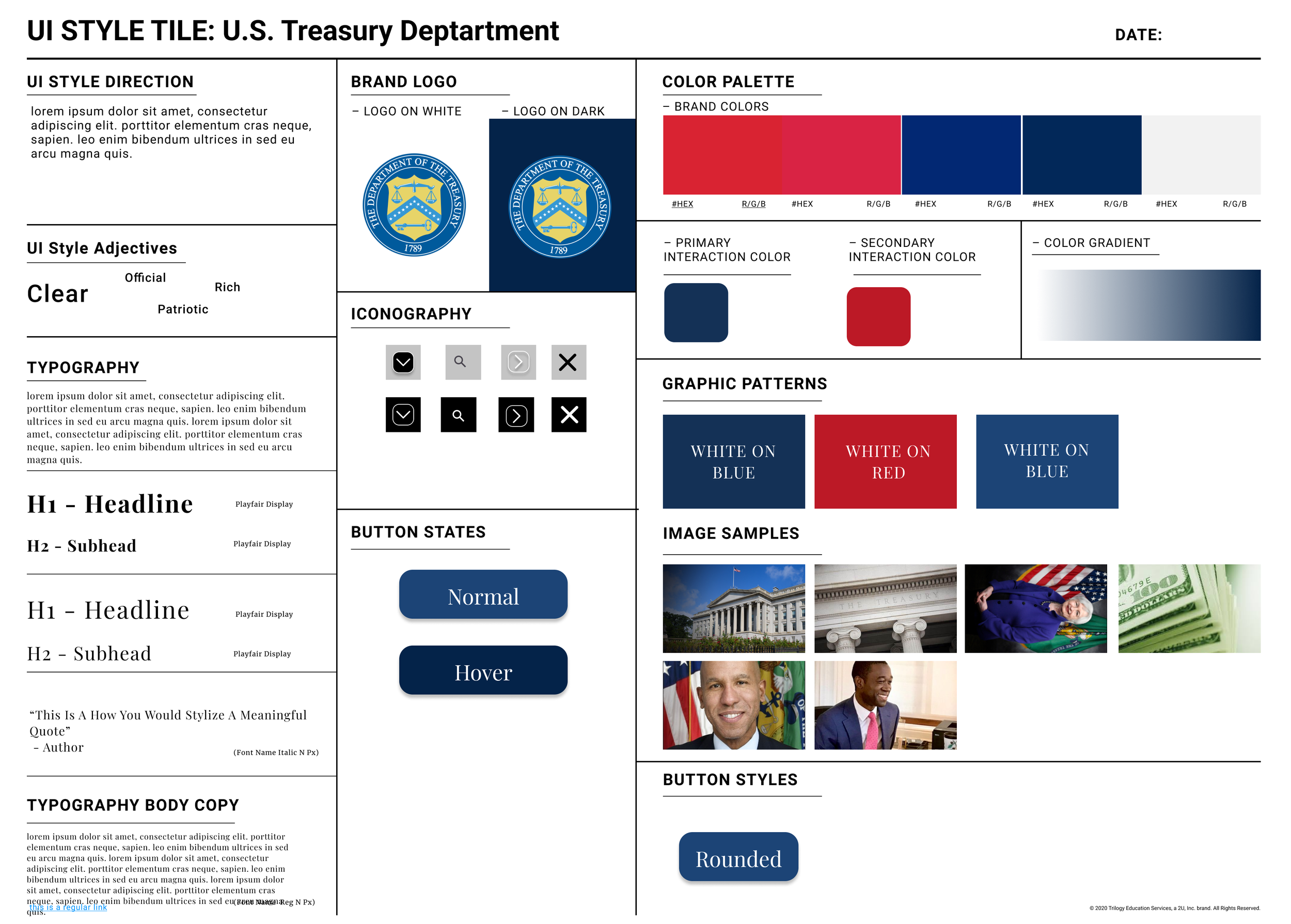
Style Tile
In creating the style tile I wanted to update the website’s color scheme. I chose colors that are easy to look at while maintaining the government theme. I updated the fonts, buttons, and icons on the pages as well. By choosing fonts that were dignified and still easy to read I believe I maintained a professional look while updating the typography.
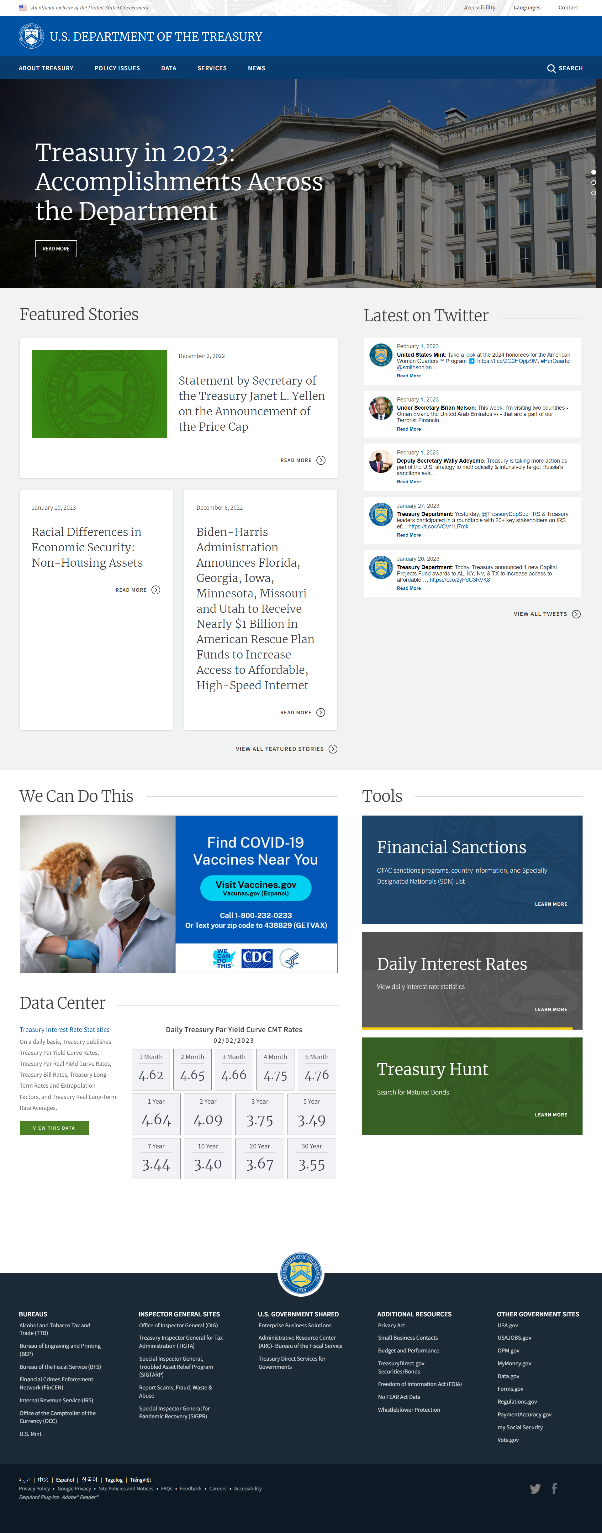
Before
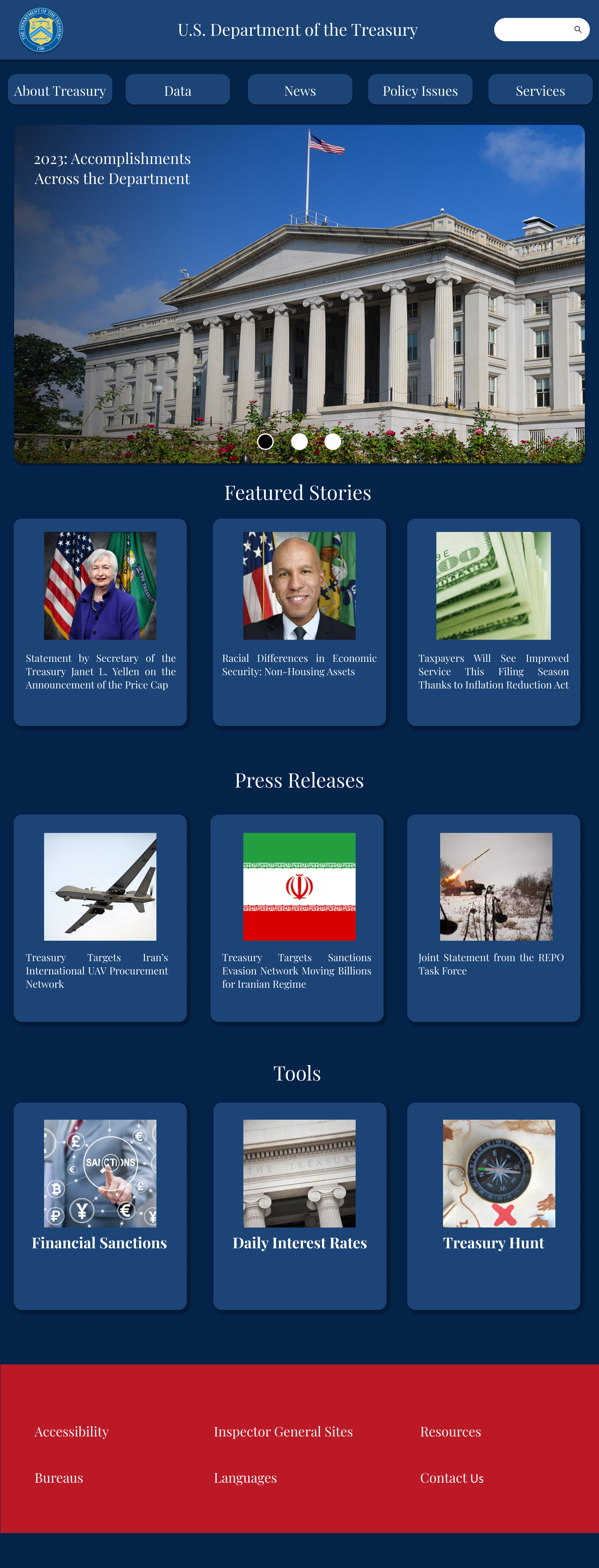
After
Mobile Design
In this project I was tasked to make a mobile design to complement the web design. I chose to keep the card style, button styles, and simplify the menu.
